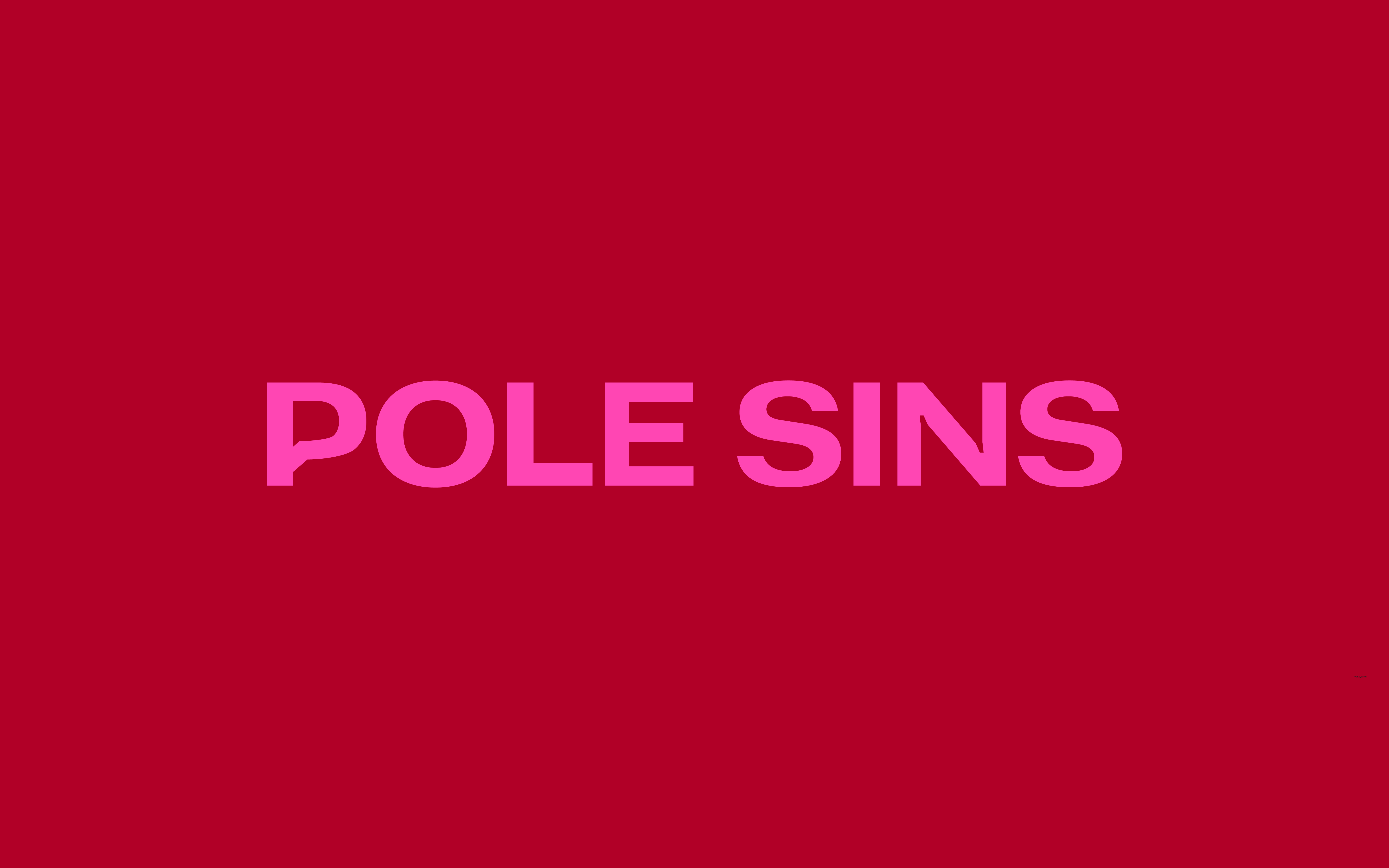
Pole Sins - Commissioned work
Brand identity refresh - CASE STUDY
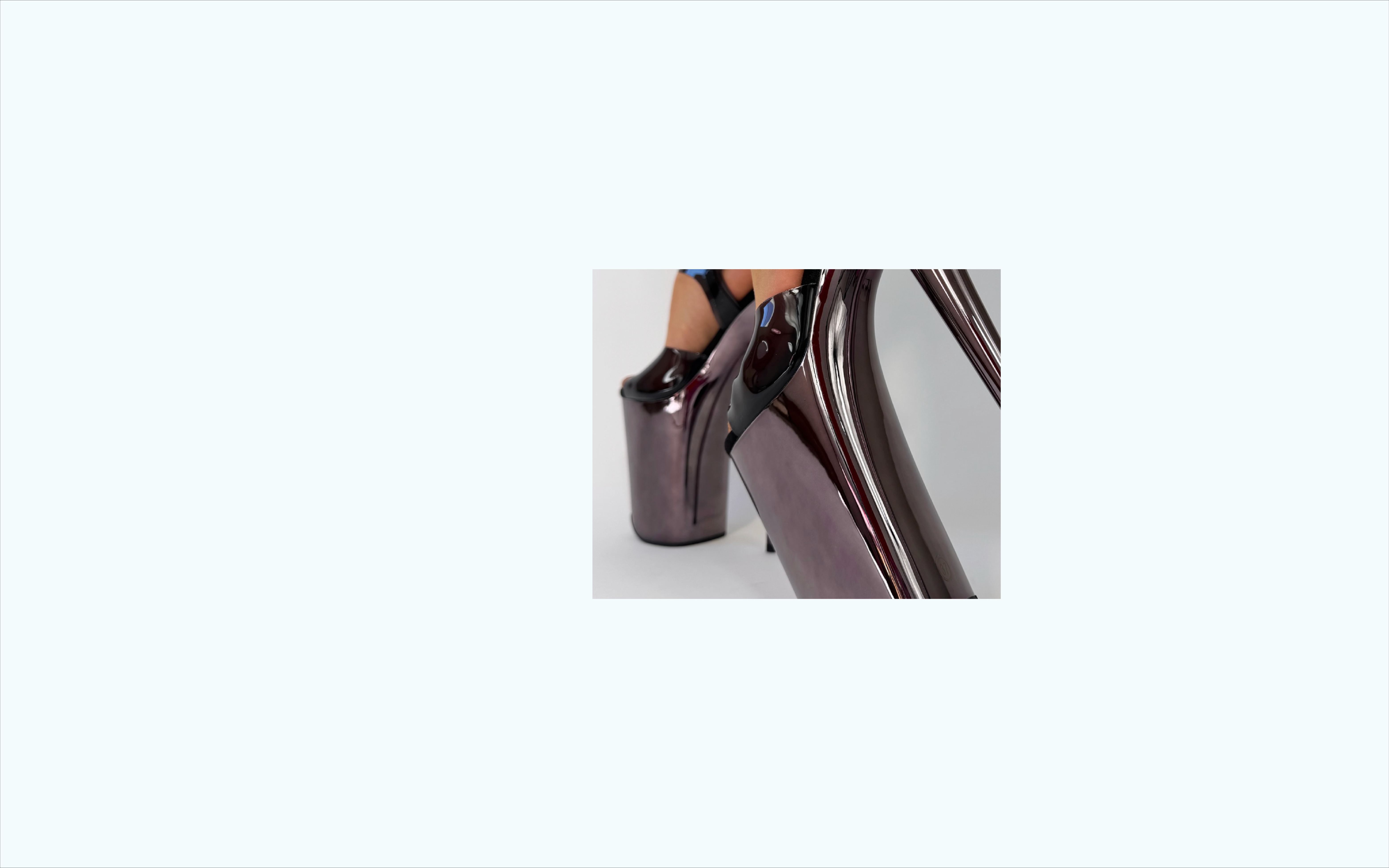
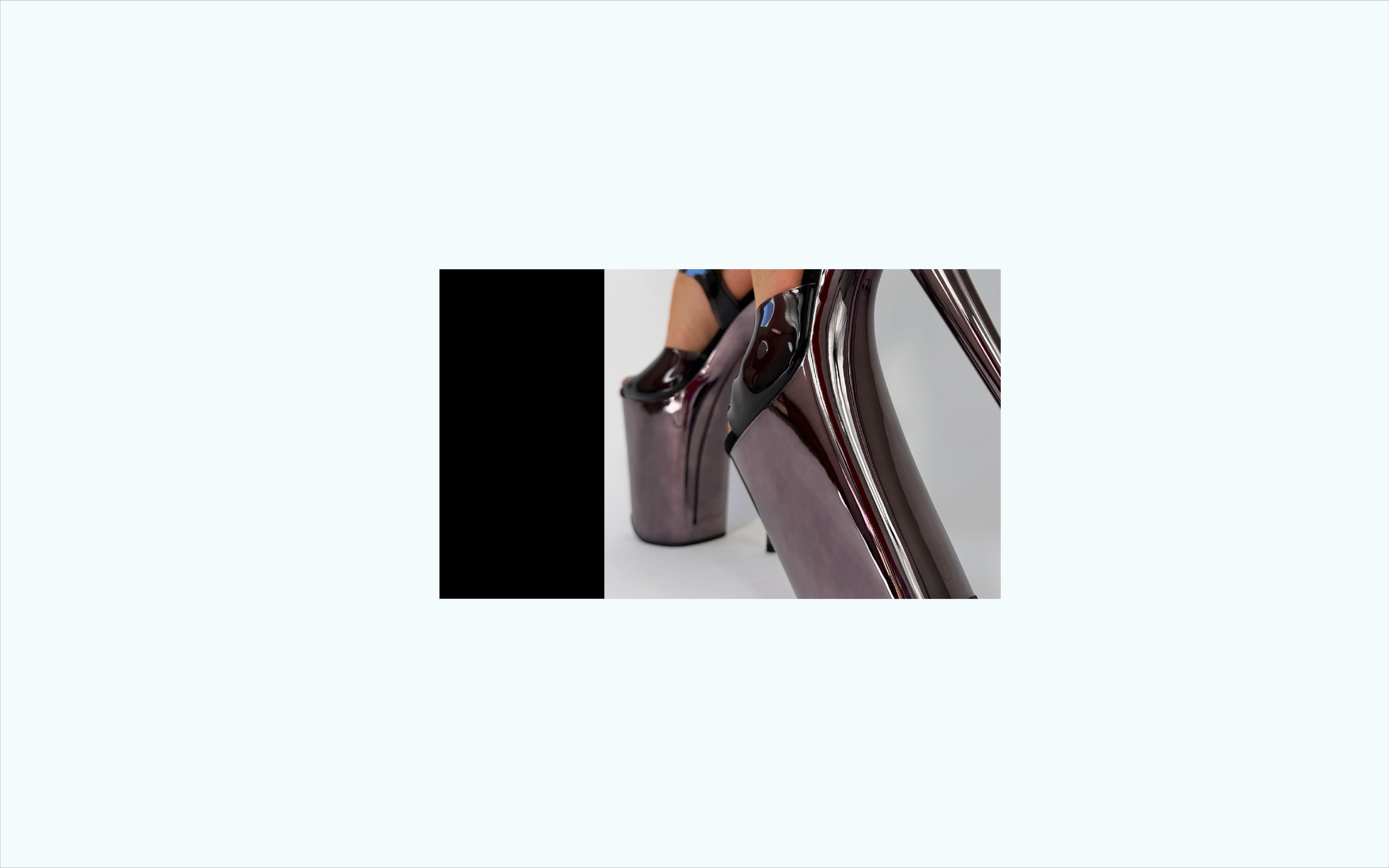
Pole Sins is an Australian-owned brand specialising in high-quality pole dancing footwear and accessories. With collections ranging from Stardust to Untamed, the brand caters to a wide spectrum of pole dancers, from performance-focused to fashion-forward. Pole Sins maintains an active presence on Instagram, engaging with their community and showcasing their products.
The goal of this project was to refresh the Pole Sins brand identity while honouring its confident, empowered foundation.
![]()
The Brief
Pole Sins wanted to evolve their visual identity into something that felt: Cool-girl, but elevated | Bold and confident without being flashy | “Baddie” energy with class and sophistication. The challenge was finding the balance between strength and elegance, creating something refined, modern, and high-end, without losing the brand’s unapologetic edge.
The Brief
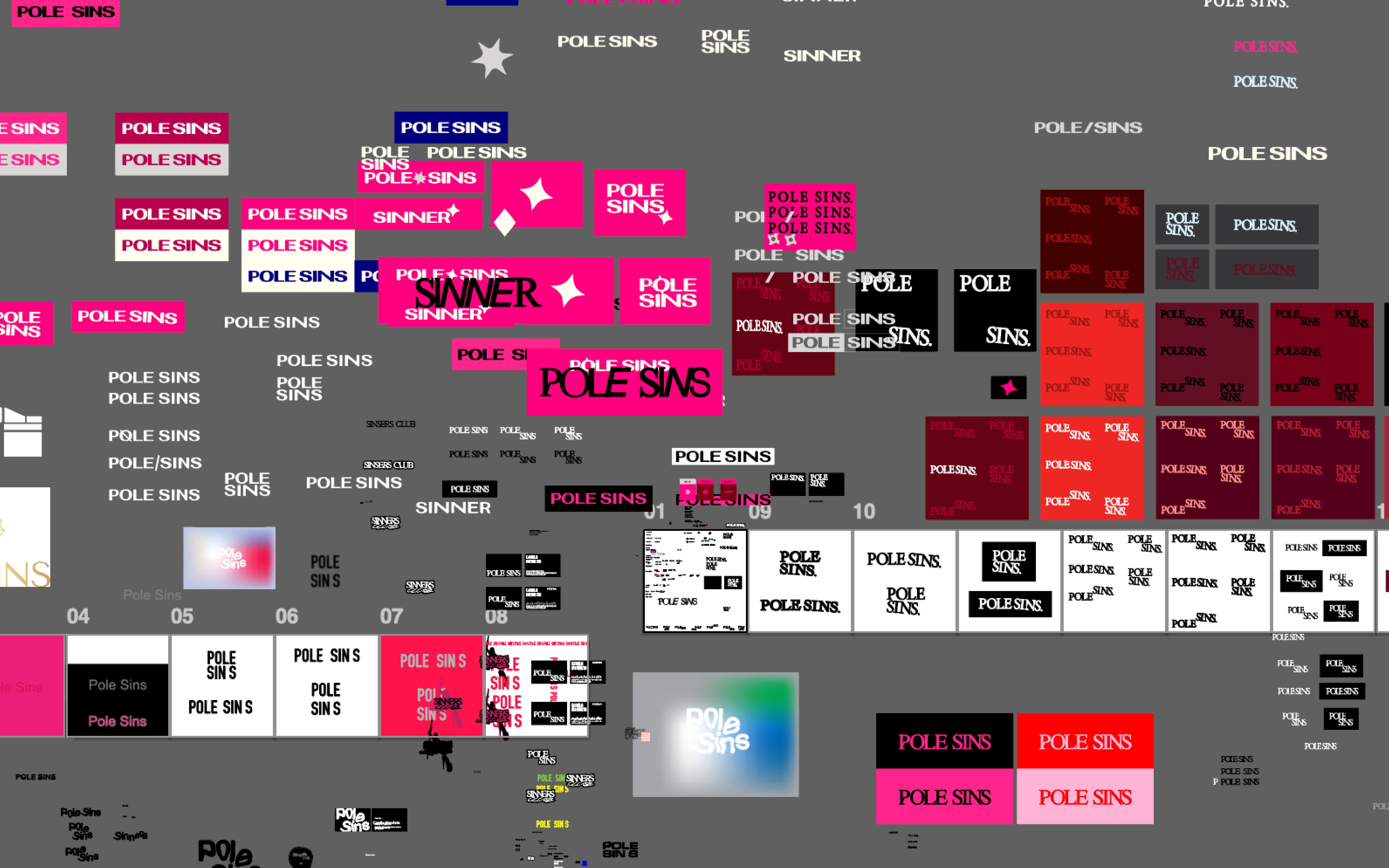
Idea Generation and Early Direction
To ground the creative process, I began with broad word associations, exploring how the brand could feel before deciding how it should look. Themes that consistently surfaced were: Unapologetic · Effortless · Rebellious · Empowered · Magnetic · Refined. From these explorations, two distinct creative directions emerged.
CONCEPT ONE
Brand Idea: Embracing New Forms - Emotive values: Unapologetic, Effortless, Rebellious - This direction focused on balance, controlled experimentation, elegance with edge, and subtle confidence.
![]()
![]()
![]()
CONCEPT TWO
Brand Idea: New Age Baddie - Emotive values: Brat, Allure, Empowerment - This concept leaned further into attitude and disruption, pushing the boundaries of legibility and form.
![]()
This concept explored distortion as a visual language.
The design was created using a warped and blurred version of Arial, a deliberate nod to the album artwork of Charli XCX’s Brat. The goal was to capture that raw, bold energy while still maintaining legibility.
The melted effect was designed to intrigue and disrupt expectation, symbolising empowerment through unconventional forms. A focal point at the dot of the “i” and the foot of the “l” subtly referenced a pole at the centre of the design, adding a layer of symbolism without being overt.
“Beautifully unconventional, distortion within the bounds of legibility.”
This concept extended into a broader typographic system using Arial and PT Mono, creating simple layouts displayed in unexpected ways. While visually striking, this direction ultimately pushed further into experimental territory than what the final brand needed.
Idea Generation and Early Direction