Tanuki’s Kitchen - Commissioned work
Brand identity - Logo design - Mascot design
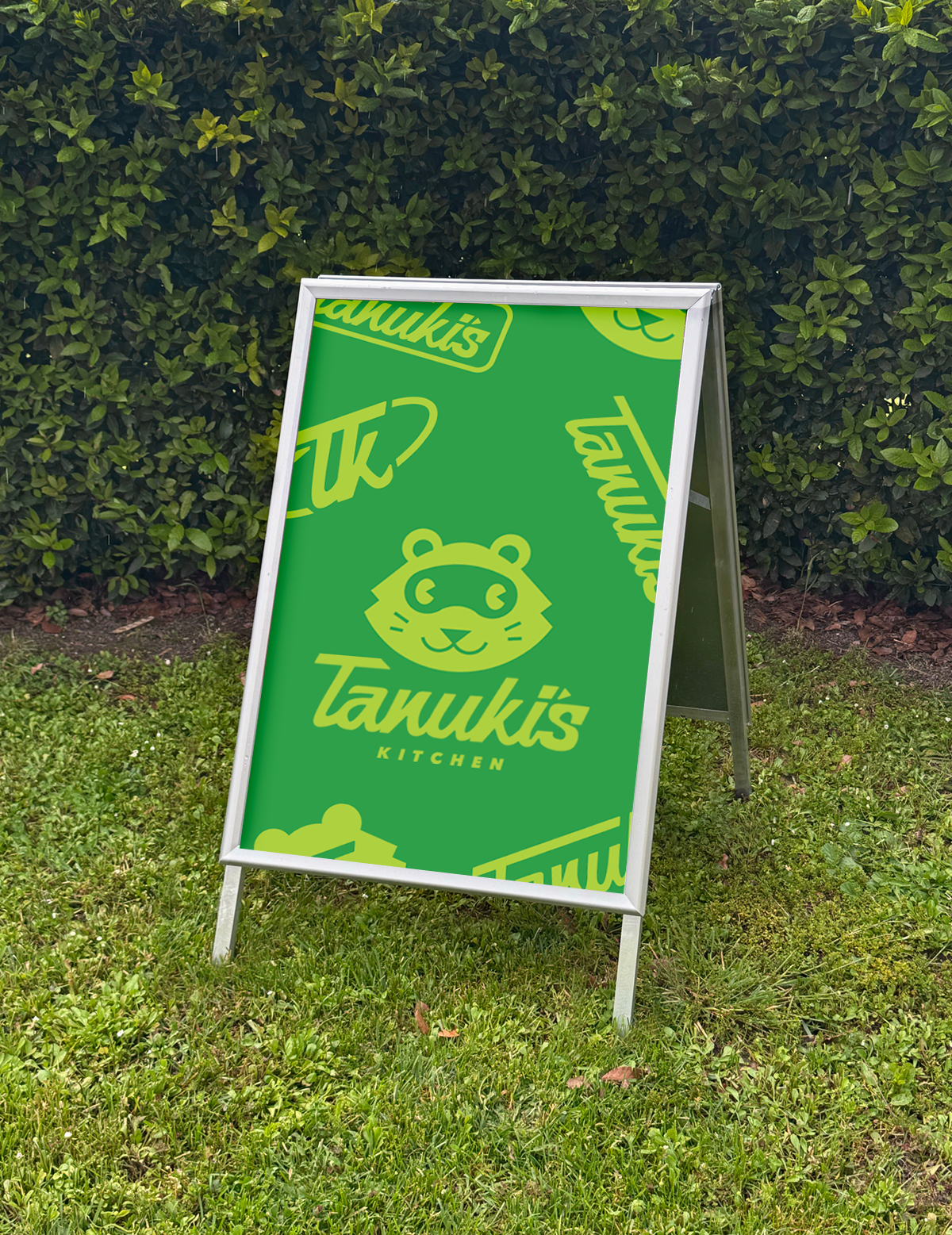
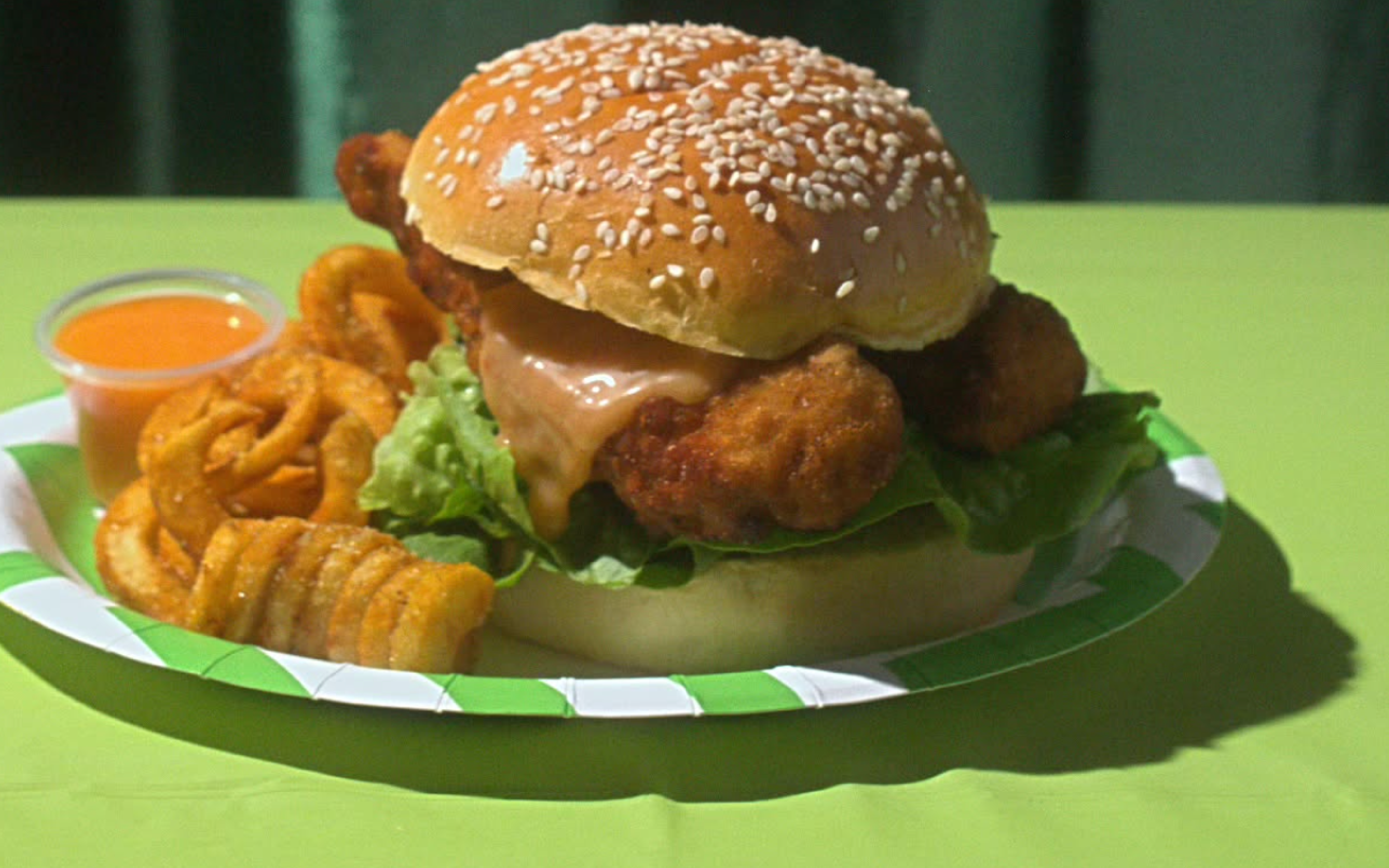
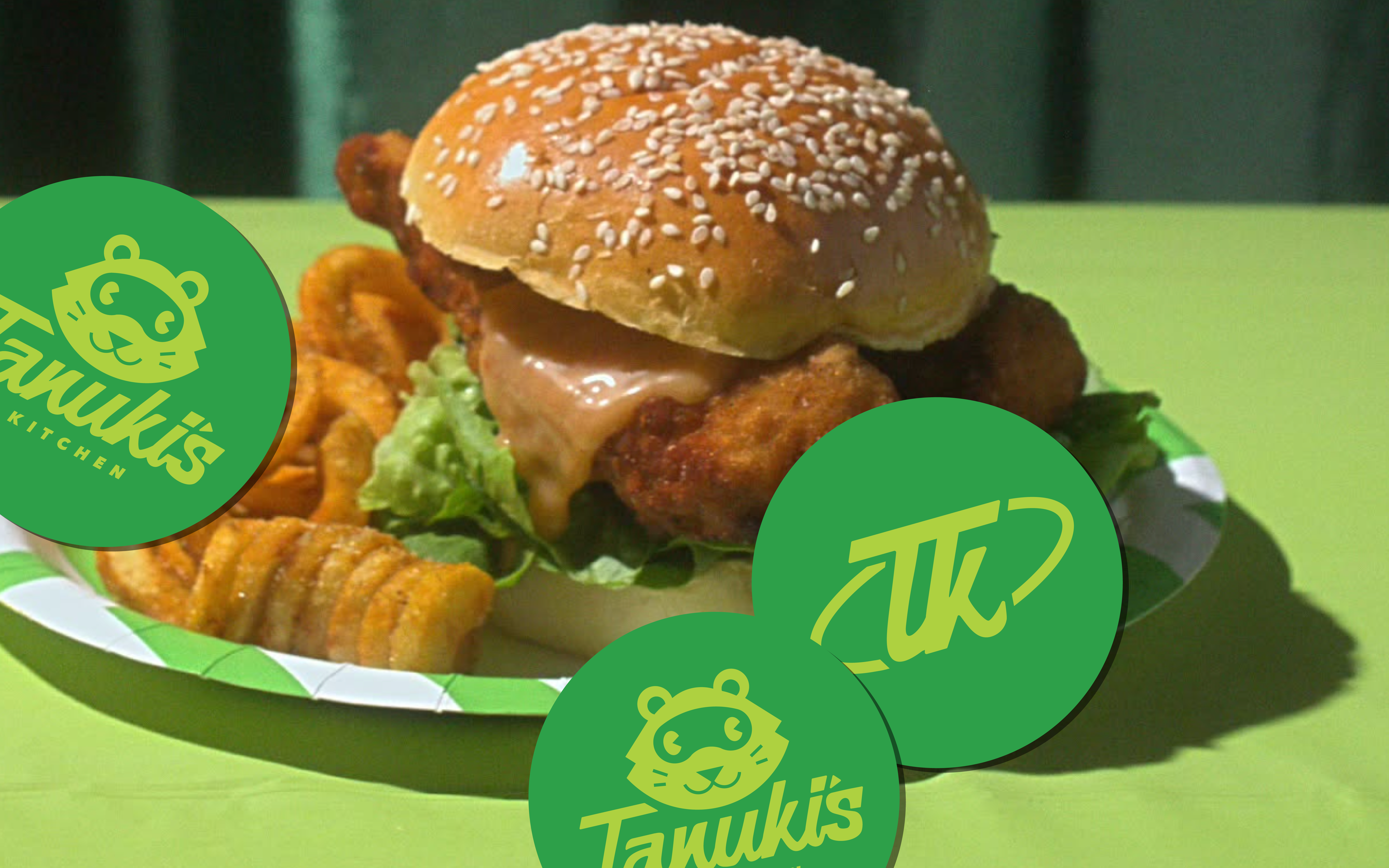
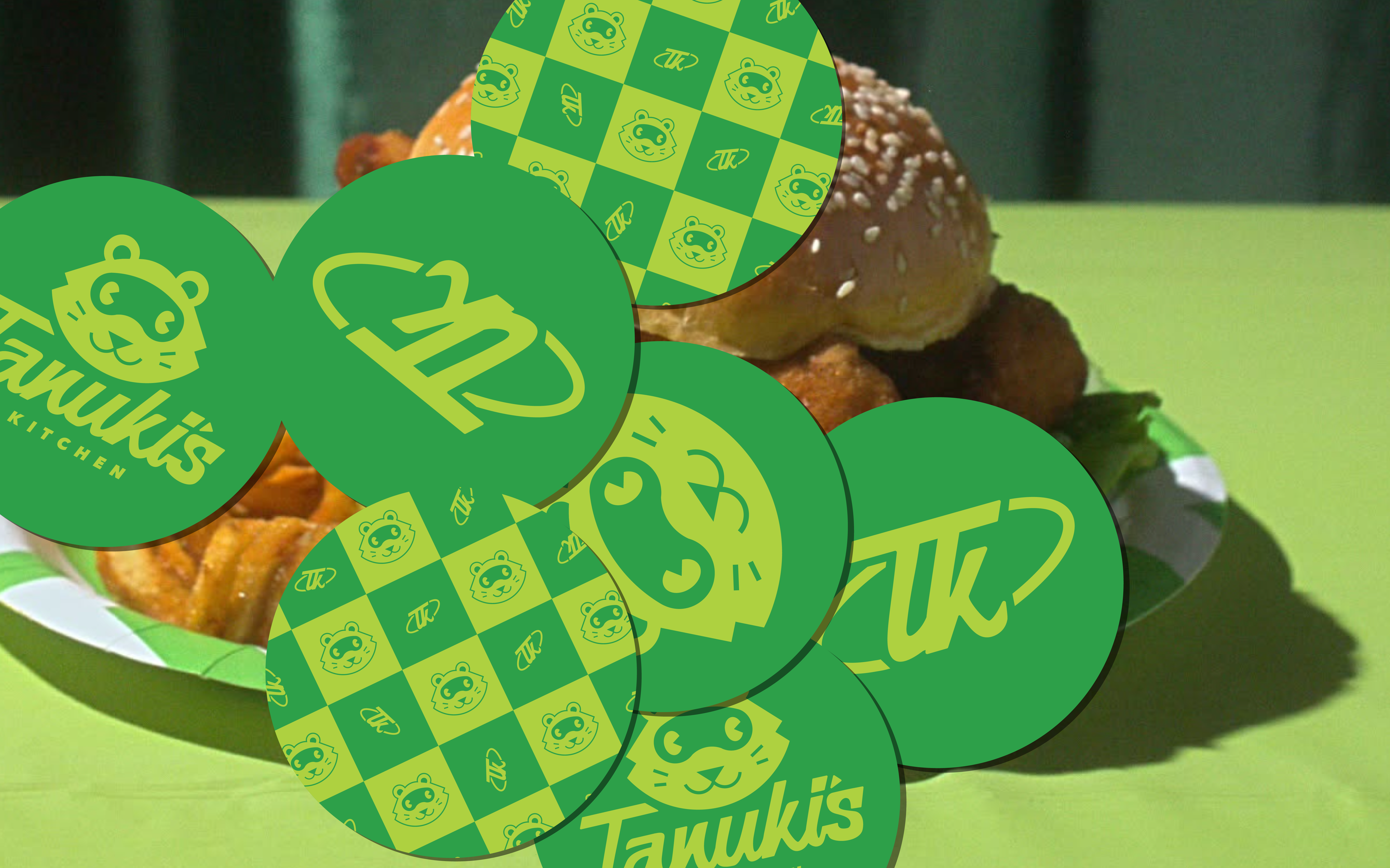
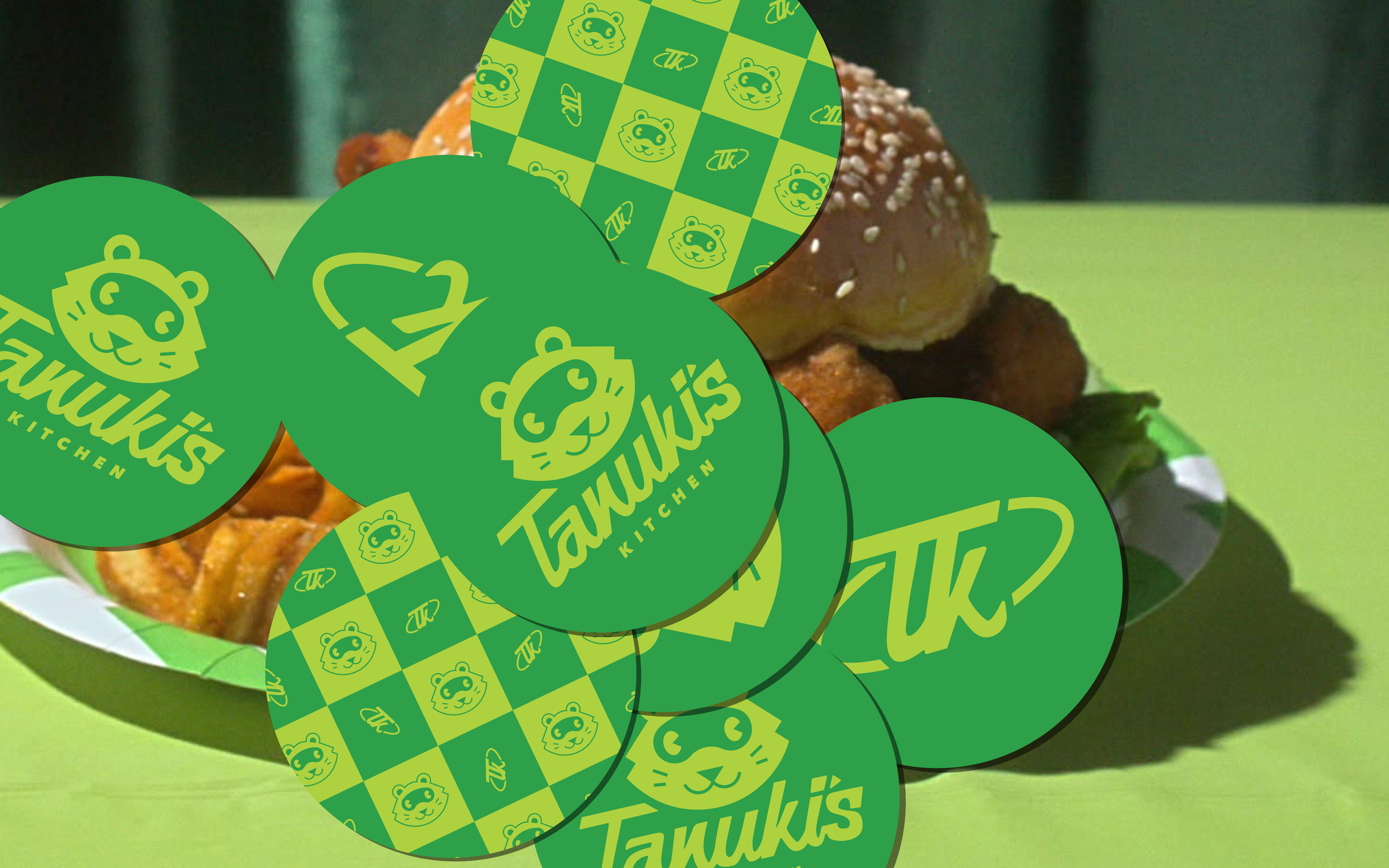
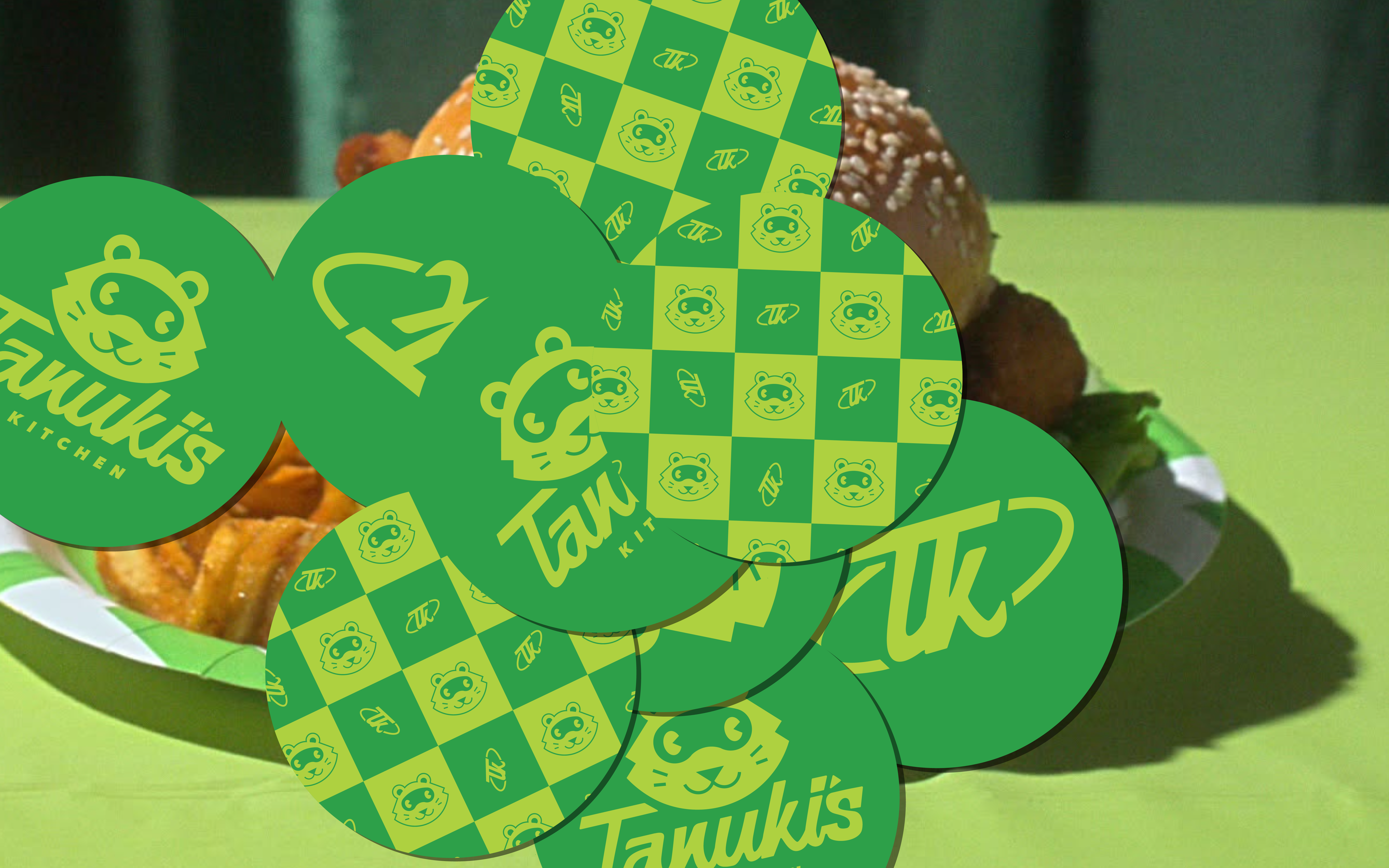
Tanuki’s Kitchen is a food brand built around a small street food truck specialising in Japanese fried chicken burgers. Rooted in comfort food and personality, the brand centres on a friendly mascot, Mr. Tanuki and a visual identity that feels welcoming and timeless.
The goal of this project was to create a brand identity that felt like a fresh taste of nostalgia.
![]()
The Brief
Tanuki’s Kitchen required a visual identity that: Felt like a long-standing heritage brand, as if it had undergone a refresh in the 1970s or 80s. Draw inspiration from vintage Japanese iconography and typographic design. Feature a custom cursive typographic logo. Incorporate a cohesive spectrum of green tones throughout the identity.

The Brief
![]()
![]()
Custom Typography
Typography became the foundation of the Tanuki’s Kitchen identity. The primary logo features a custom cursive script for Tanuki’s, created to feel expressive and confident. The upward slant adds energy, while the hand-drawn quality reinforces the idea of a brand built with care and personality.
Kitchen is set in an italicised version of Avenir Next, providing a clean, modern counterbalance to the custom script. This contrast ensures the logo feels nostalgic without becoming dated, and legible without losing charm.
![]()
Custom Typography